EngFlow · developer build acceleration
The build engine was already fast; the product had to make that speed visible, and let teams onboard to it without our help.
Change one line of code and you often have to retest everything, just to be sure that small change didn't break something elsewhere. On a large codebase, that waiting adds up fast, and it was the frustration I kept hearing from developers.
Bazel fixes that by rebuilding only the parts that actually changed, and leaving the rest untouched. My job was to make that speed something teams could feel and trust, and that had to be reflected in the UI itself.
A UI developers
can trust.
The engine was already fast. My job was to make that speed something a developer could see and believe, so the interface earned the same trust the build system had.
I was the first product designer at EngFlow, so most of this started from a blank page. I set the vision for MyEngFlow, worked closely with engineering and product to decide what actually mattered, and built the design strategy and foundations the product could grow on. The goal never changed: take a deeply technical build system and turn it into something a team could see, understand, and use.
We shipped MyEngFlow: a self-serve workspace that helps a new team understand the value and onboard themselves, guiding them from sign-up to a running cluster in a few clear steps. Getting people to that first fast build on their own meant the product handled about half of the onboarding our team used to do by hand.
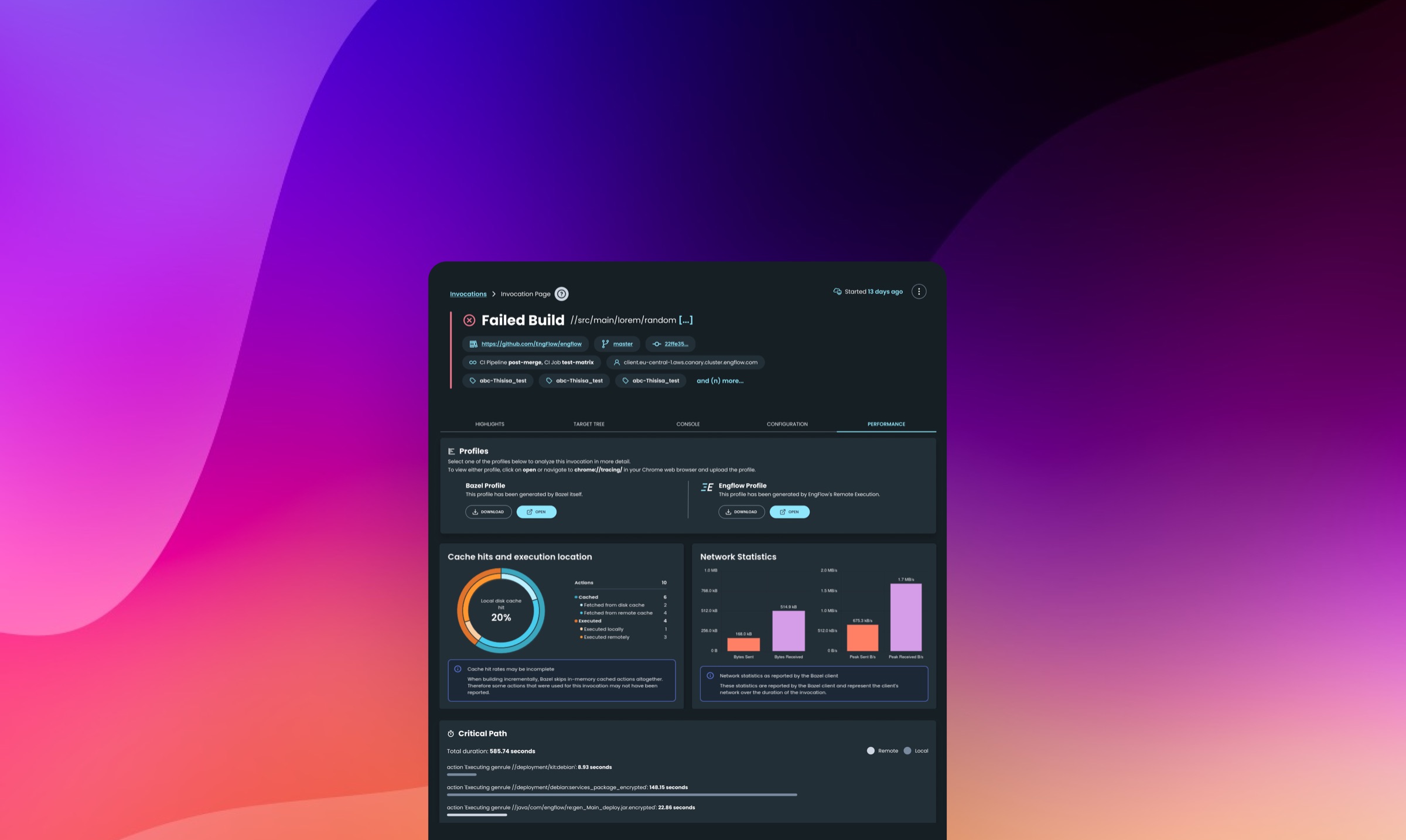
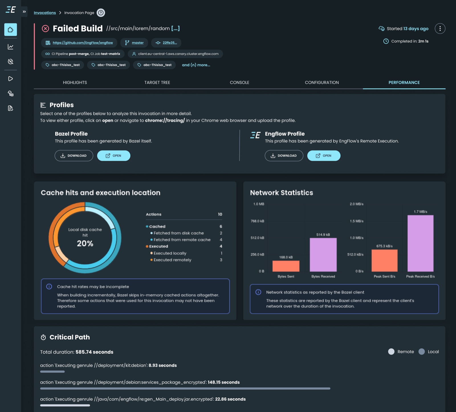
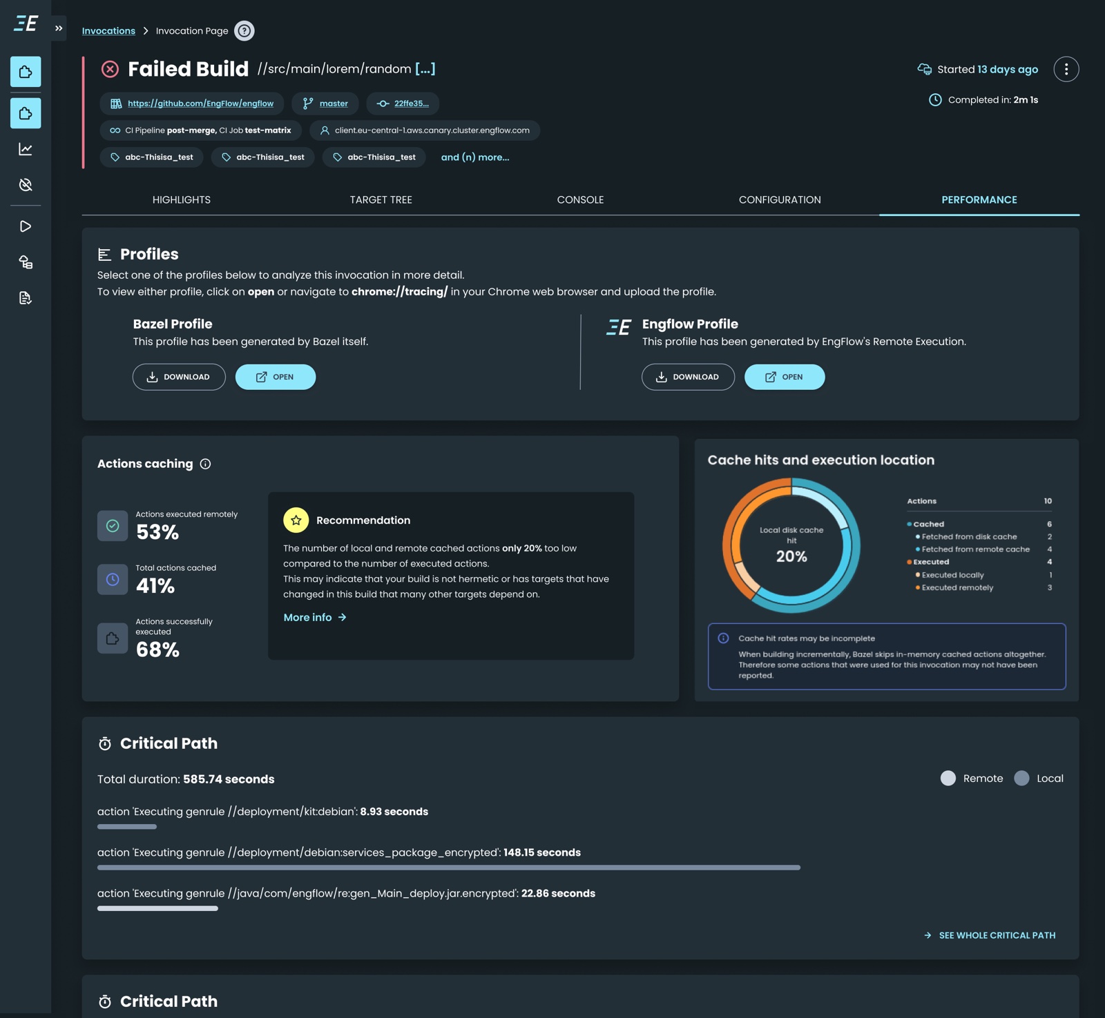
With the trial in place, I moved to the main EngFlow platform, the product teams live in every day. The engine was already fast, so the design question was different: how do you show that speed in the UI, and help a developer see where they could go faster still? I designed the landing, the invocation page, and its performance graph to make every build legible, cache hits, execution location, and the critical path, so the biggest opportunities to speed things up surface first. The comparison feature then let teams line up any two builds and spot exactly what changed.
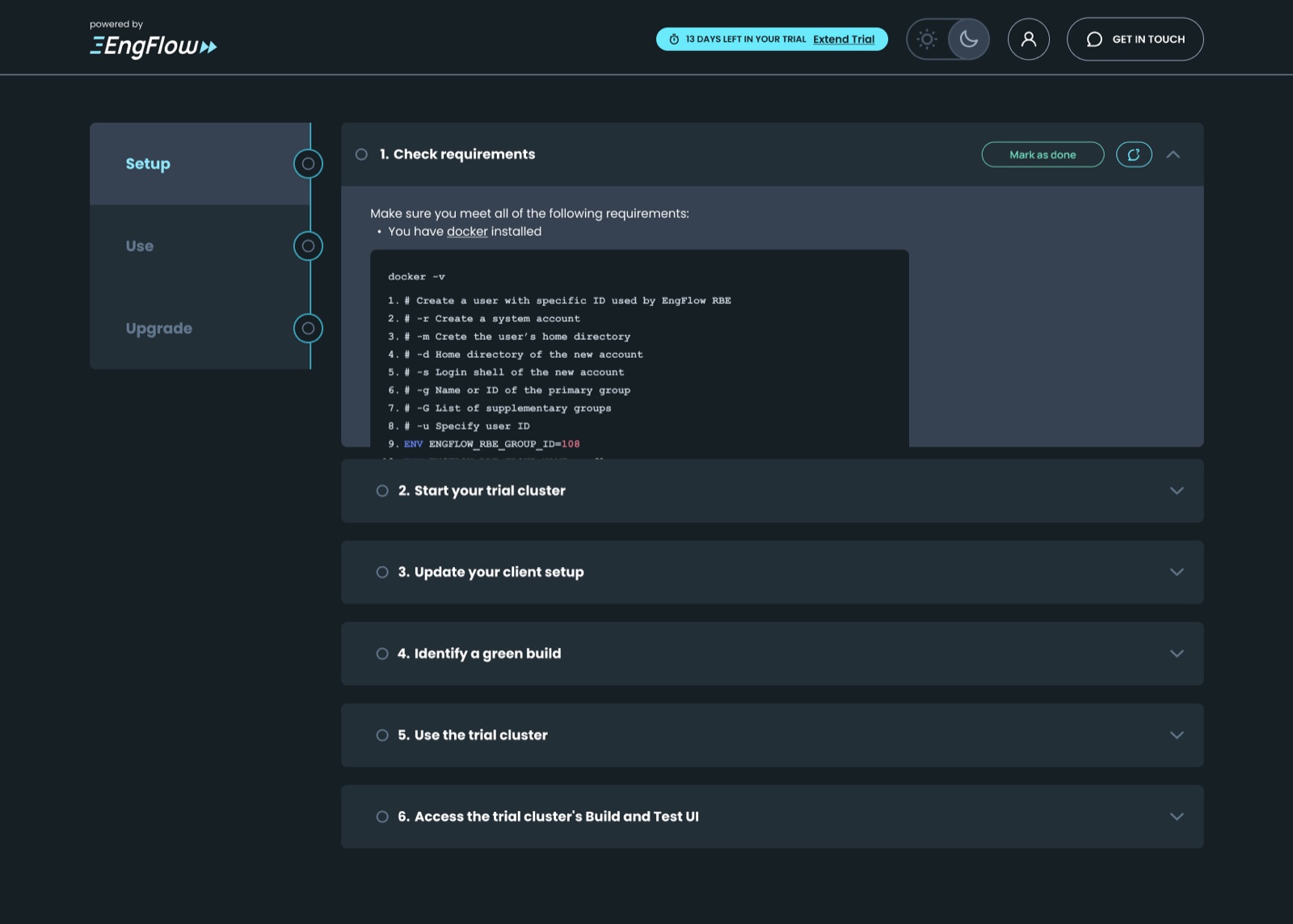
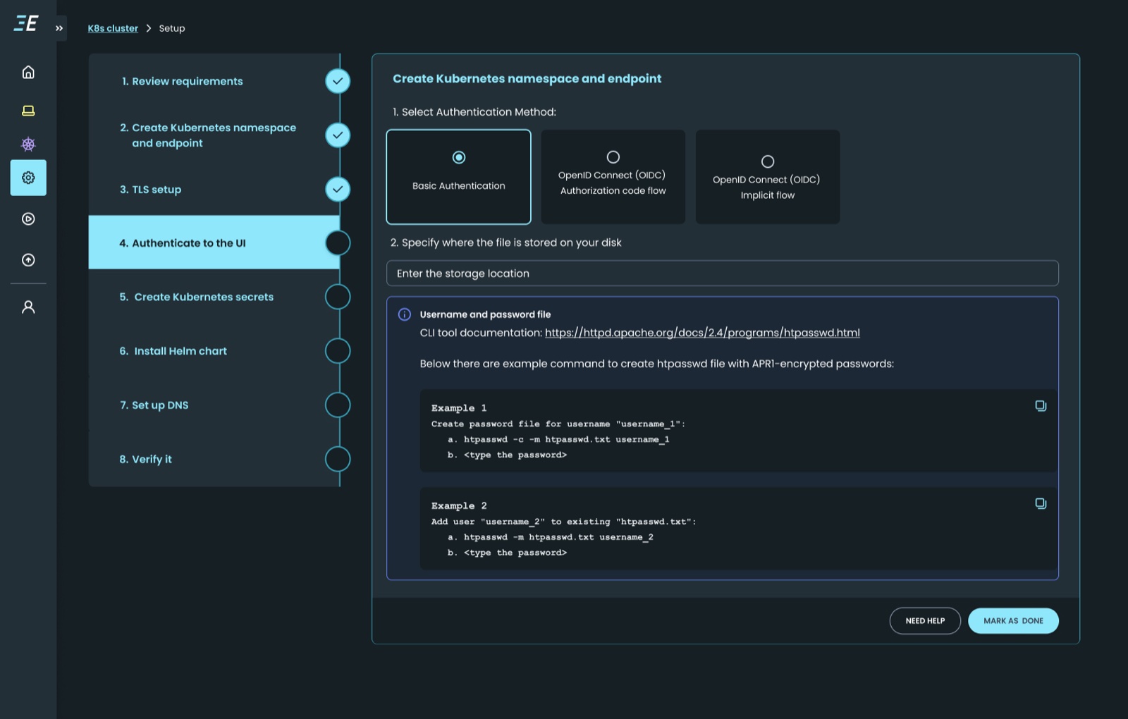
In the initial version, setup lived in an accordion: every step expanded and collapsed in place, so the page jumped around and you never saw how the steps connected. After user testing I rebuilt it as a connected stepper, one step at a time, progress ticked off as you go, and the exact command right where you need it.
The invocation page already showed where a build's time went, cache hits, execution location, the network, the critical path. But a developer still had to read all of it and work out what to change. I added recommendations that read the build's own signals and turn them into a plain-language next action.
Being the first designer meant making sense of a lot of ambiguity, and turning deep technical workflows into something a team could see, understand, and act on. What I'm proudest of is that the design system and strategy I built are what let the product keep scaling.